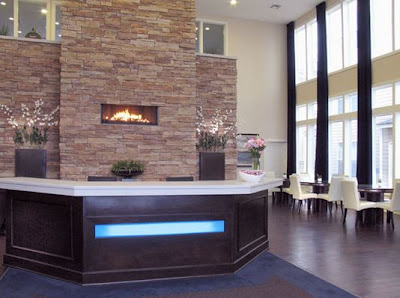
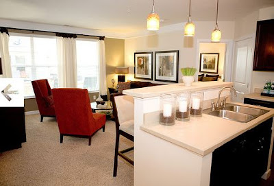
In the May issue of 614 Magazine, the favorite favorites of Columbus were featured by the readers. The best residential apartment was, Alexander Square. We were honored to be part of the interior design, and more importantly, know that people enjoy where they live.
In this project our inspiration started with the natural elements of the stone. We continued the stone into the interiors using that as a focal point.Chocolate was the anchoring color used throughout the project. Complimenting the brown, indigo blue was used as one of the primary colors.
The draperies were 22' long. We installed them at the ceiling to accent the height and overall open feel (drawing your eye upwards). In my designs, I always use green in some aspect or another - whether it's in upholstery, paint, draperies, or foliage. Green is the color of life and really breathes that life into any space. Here, we used it in the high back chairs and in the wheat grass on the mantle - again carrying the natural elements throughout.
On the opposing wall of the blue velvet draperies, white sheers were hung along the entire wall to soften the large space, adding another layer into the room. I love to use fabrics in my designs. Textiles are the beginning inspiration of most of the environments that we create.


No comments:
Post a Comment